Map is an image that represents a geographic area in a way that helps people find places or understand the area’s features. Many maps show places or conditions on Earth. Maps may also depict other planets, the moon, or the position of stars in space.
We use maps to locate places, measure distances, plan trips, and find our way. Pilots of ships and airplanes use maps to navigate. City planners and engineers use maps to decide where to put new buildings or roads. Maps also help us understand such patterns as where people live, how ocean currents flow, or how much rain falls. Maps may also offer clues about conditions beneath Earth’s surface. For example, geologists use maps to help find oil, gas, and other resources.
Making or studying maps is called cartography. A person who creates maps or knows much about them is a cartographer. To design maps, cartographers use lines, colors, shapes, and other symbols. These symbols stand for such features as cities, forests, rivers, or roads.
A cartographer decides which features a map should show by considering how people will use the map. Because maps are much smaller than the area they represent, the features on a map are greatly reduced in size. For example, 1 inch (2.5 centimeters) on a map might represent a distance of 100 miles (160 kilometers) on Earth’s surface. A tiny circle might stand for a large city.
Because Earth is round, the best way to represent it is on a globe, a map that is round like a ball. A globe shows the location and shape of geographic areas exactly as they are on Earth. But flat maps are more convenient. Unlike globes, flat maps are easy to carry, print in books, and display on the screens of electronic devices.
Flat maps, however, are not completely correct. Representing the round Earth on a flat surface requires stretching some areas and shrinking others. This stretching and shrinking is called distortion. Cartographers use mathematical methods called projections to make Earth look flat. Every type of projection distorts distances. Other features, such as land shapes or areas, may also be distorted. But each projection is useful in some important ways. For example, the Mercator projection exaggerates the size of areas near the North and South poles. But navigators have used Mercator projections for centuries because a path in any direction can be drawn as a straight line on these maps.
People probably made rough maps even before they began to use written language some 5,500 years ago. Over the centuries, maps became more accurate as people explored the world and developed improved ways to make maps. During the 1900’s, people began to use aircraft and spacecraft to observe Earth and other heavenly bodies. These observations enabled people to create more accurate maps than ever before.
Today, cartographers make most maps using computers. One of the most powerful cartographic tools is a geographic information system (GIS). Such a system consists of computers, computer programs, and extremely large amounts of information. The information, which is stored as computer code, can include measurements or photographs taken from land, sea, or space. Cartographers can use such a system to produce many different maps from the stored data.
Computers have increased the ways in which map users can consult or obtain maps. Many programs for making maps are available for personal computers. A computer’s memory can store large amounts of data and many maps. People can choose exactly the areas they want to view, and then display or print a map. Many maps are available on the Internet. Users can view Internet maps on their personal or handheld computers.
Types of maps
Cartographers create many types of maps for a variety of purposes. Some common types are general reference maps, navigation maps, thematic maps, and inventory maps.
General reference maps
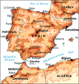
show the names and locations of many kinds of natural or constructed features. Such maps may include bodies of water, cities, mountains, plains, roads, and many other features. The main purpose of general reference maps is to help people find and identify places. Maps in atlases are general reference maps that show large areas of Earth. Topographic maps are general reference maps that show the details and heights of land features in a small area.
Some general reference maps show a small area, such as the roads and house lots in one part of a city, in great detail. These maps, called plats, may serve as legal documents for such purposes as selling property. Political maps show the boundaries of units of government, such as counties, states, and countries.
Navigation maps,
also called mobility maps, show people how to find their way from one place to another on land, on water, or in the air. Navigation maps for ships or airplanes are called charts.
Road maps
are the most familiar navigation maps. These maps show different types of roads, including interstate highways, smaller local highways, and scenic routes. They also show the cities, towns, parks, and other sites connected by these roads. Travelers use road maps to plan trips and follow lengthy routes.
Street maps
are like road maps but show a much smaller area in much greater detail. People use street maps to find particular addresses and to plan and follow short routes.
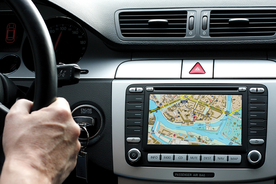
In-vehicle navigation systems
create maps to guide drivers of moving vehicles. These systems constantly track a vehicle’s location by using signals from a group of space satellites called the Global Positioning System. A computer in the vehicle combines the position data with stored street map data and produces maps of the route to a destination. The maps change as the vehicle moves. Most in-vehicle systems show the map on a small screen and can produce spoken directions.
Transit maps
show the routes traveled by buses, trains, subways, and other types of public transportation. Transit maps also show where people can board public vehicles and make connections between routes.
Aeronautical charts
are used to navigate airplanes. Depending on their level of certification, pilots use Visual Flight Rules (VFR) or Instrument Flight Rules (IFR) charts. VFR charts show landmarks that pilots can see as they fly, such as bridges, roads, and towns. VFR maps also show airports and indicate the heights of mountains and other obstacles. IFR charts are designed for radio navigation. These charts show the location of transmitters of high-frequency radio signals. Pilots use these signals to determine their position and plot their course.
Some airplanes are equipped with computer systems that produce heads-up display maps. These maps are projected near eye level where the pilot can see them without looking down.
Nautical charts
are used to navigate ships and boats. Nautical charts show buoys, islands, lighthouses, water depths, and such dangers as coral reefs and underwater mountains. These charts also locate sources of radio signals that crews use to plot their course and position.
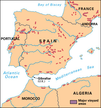
Thematic maps
show how a particular feature, such as population, rainfall, or a natural resource, is distributed over an area. These maps are used to study overall patterns—for example, how the average yearly rainfall varies from one part of Canada to another.
Many thematic maps express quantities by means of colors or symbols. Some thematic maps express quantities by using lines called isolines or isograms that connect areas of equal value. Some specific types of isolines have special names. On a weather map, for example, isolines called isobars connect places that have the same air pressure. Isolines called isotherms are used to indicate areas of common temperature. On topographic maps, contour lines show areas that are the same height.
Thematic maps may also use variations in size or shape to express quantities. A map of the international petroleum trade might indicate large exports of oil with thick arrows and small exports with thin arrows.
Inventory maps,
like thematic maps, focus on a specific feature. But unlike thematic maps, which show only the distribution pattern of a feature, inventory maps provide the exact location of each featured item. For example, an inventory map might show every source of air pollution in a community, every school in a district, or every campsite in a park.
Reading a map
Using a map requires certain skills. To read a map, it is necessary to understand map legends, scale, a north arrow, geographic grids, and map indexes.
Map legends
list and explain the symbols and colors used on a map. Some symbols resemble the features they represent. For example, a small tree might stand for a forest, an orchard, or a state park. But many symbols have little resemblance to the features they represent, as when a circle stands for a city. The same symbol may represent different features on different maps. For example, a triangle might represent a mobile home park on one map and an eagle’s nest on another. Such differences make it important to read the map legend to find out what each symbol means on a particular map.
Scale
shows the mathematical relationship by which distances on a map reduce actual distances on Earth. Many maps illustrate scale by marking off distances on a straight line. Each mark shows how distance on the line corresponds to miles, kilometers, or other units of measurement on Earth. Other maps state the scale in words and figures. Such a scale might appear as 1 inch: 16 miles. In this relationship, 1 inch (2.5 centimeters) on the map represents a distance of 16 miles (26 kilometers).
Representative fractions are also used to show scale. Such a fraction indicates the number of distance units on Earth represented by one unit on the map. In the example above, where the scale is 1 inch: 16 miles, the representative fraction would be 1:1,000,000 or 1/1,000,000 because there are 1,000,000 inches in 16 miles. The relationship remains the same for inches, centimeters, miles, kilometers, or any other units of measurement.
Scale varies widely, depending on the size of the area a map represents. A small-scale map greatly reduces distances on Earth to show a large area in limited detail. Each distance unit on a small-scale map represents a large number of units on Earth. These maps are called small-scale because their representative fractions are small. The large number of distance units represented on Earth goes into the denominator, making the value of the fraction small. For example, on a map showing a nation’s highway system, the scale might be 1:12,672,000, in which 1 inch represents 200 miles (322 kilometers).
A large-scale map shows a small area in great detail. These maps are called large-scale because their representative fractions are large. Each distance unit represents a relatively small number of units on Earth. The small number of units makes the denominator of the representative fraction relatively small and the fraction’s value relatively large. For example, a city street map might have a scale of 1:31,680, in which 1 inch represents 1/2 mile (0.8 kilometer).
A north arrow
shows the direction of north on a map. The arrow often has the letter N or the word North written over it. Maps without a north arrow usually show north at the top of the map or include a geographic grid to help the user determine the direction.
Geographic grids
are networks of imaginary lines that help us find and describe places on Earth. These grids are commonly shown on maps. The most common grid is called a graticule. This grid divides the globe using lines called parallels that show north-south position and lines called meridians that show east-west position.
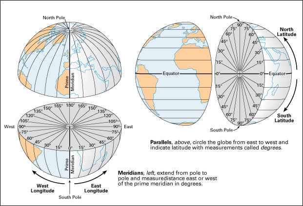
Parallels are circles around the globe that measure latitude. Latitude describes position north or south. Latitude is expressed in mathematical measurements called degrees. The equator is the parallel that lies at zero degrees (written 0°), exactly halfway between the North Pole and the South Pole. The North Pole has a latitude of 90° north, and the South Pole has a latitude of 90° south. Every point on Earth that lies north of the equator has a latitude between 0° and 90° north. Every point south of the equator lies between 0° and 90° south.
Meridians extend from the North Pole to the South Pole, forming half-circles around the globe. Meridians, also measured in degrees, indicate longitude (east-west position). By international agreement, mapmakers place the 0° meridian on a line that passes through Greenwich << GREHN ihch, GREHN ihj, or GRIHN ihj >> , England, a district of London. The Greenwich meridian is often called the prime meridian. The meridian in the Pacific Ocean that forms the other half of the prime meridian’s circle lies at 180°. Longitude measurements range from 0° to 180° east and from 0° to 180° west.
If we know the latitude and longitude of a place, the graticule enables us to find that place on a map. Longitude and latitude measurements can be used to pinpoint any place on Earth. For example, only one place—New Orleans in the United States—lies exactly at 30° north and 90° west.
Map indexes
list the features shown on a map in alphabetical order and provide an aid to locating the features. In many atlases, each index entry lists a feature’s latitude, longitude, and map number. People can use the latitude and longitude to find the feature on that map.
Many maps of small areas, such as street maps, are divided into horizontal rows and vertical columns. The rows and columns are labeled with letters and numbers. Each feature in the map index is followed by a letter and number corresponding to one row and one column on the map. People can find the feature in the small section of the map where that row and column cross.
Map projections
A map projection is any of a number of mathematical methods that cartographers use to produce a flat map of the round Earth. Creating a map projection can be imagined as having two steps. The first step is mapping Earth on a globe of a chosen scale. The round globe can exactly represent the round Earth, with shapes of features and distances shown accurately.
The second step involves choosing a mathematical approach that, in effect, peels the surface off the globe and flattens it. This flattening always involves distortion—that is, stretching the surface in some areas and shrinking or tearing it in others. Different types of projections produce predictable inaccuracies in shapes, distances, or relative sizes of features. Distortion is most significant on maps of the whole Earth or large areas of it.
No single projection is best for all purposes. Cartographers decide which projection to use by considering the ways in which a particular map needs to be accurate. Computers enable cartographers to choose from among a large number of projections.
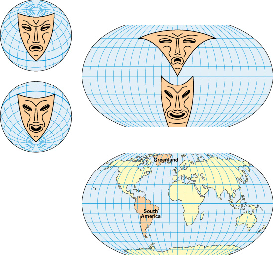
Familiar faces can demonstrate how a particular method of projection distorts Earth’s surface. The three illustrations in this section use the traditional masks of Comedy and Tragedy to show the kinds of distortions that are created by three important types of projections: (1) the Mercator projection, (2) the Mollweide projection, and (3) the Robinson projection.
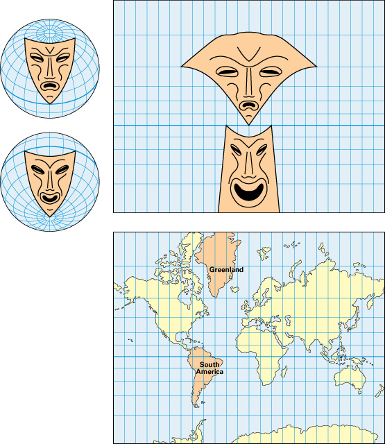
Each illustration includes a pair of undistorted globes, one showing Tragedy’s sad face in the Northern Hemisphere and one showing Comedy’s smiling face in the Southern Hemisphere. Each illustration shows what happens to these faces when they are transferred to a flat map that uses one of the three types of projections. Comparing the images in the illustrations will help you see how different projections distort the features differently.
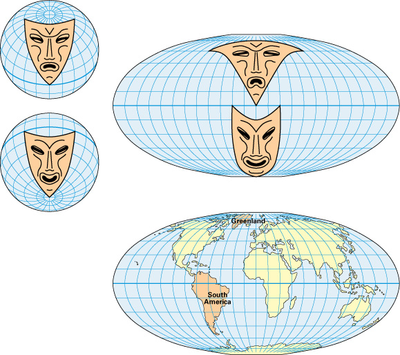
Each of the three illustrations also shows how Earth looks when it is mapped using one of the three types of projections. Comparing these maps with a globe will help you see how the projections distort Earth’s surface.
How maps are made
Cartographers transform a wide variety of information into useful, attractive maps. In general, mapmaking follows certain basic steps. The first steps are observation and measurement. Next come database development, planning, and graphic design. The final steps are production and reproduction, and revision.
Observation and measurement.
Cartographers observe and measure geographic features to collect fundamental information called base data. Base data were originally obtained chiefly by means of measurements performed on Earth. For example, specialists called surveyors work out locations and boundaries of places by measuring distances, angles, and heights. After airplanes came into use in the early 1900’s, aerial photographs became an increasingly important source of base data. Since the mid-1900’s, spacecraft have provided another valuable source of data. For example, the Global Positioning System of satellites produces signals that can be used to calculate exact locations on Earth. Other satellites record and send back images of the planet.
Base data may be used to create large-scale topographic maps that show a small area in great detail. Cartographers produce maps of larger areas by compilation mapping. Compilation mapping combines selected information—for example, political boundaries—from several smaller, highly detailed maps. During compilation, cartographers may also include statistical data, such as population distribution, rainfall averages, or tax rates.
Database development.
Base data and statistical data are generally stored electronically in a collection of computer records called a database. In the United States, the U.S. National Geospatial-Intelligence Agency, the U.S. Geological Survey, and the U.S. Census Bureau maintain large databases of geographic information. The agencies make much of this geographic information available free for use by other government agencies, private companies, or individuals.
In many cases, mapmakers then add specialized information to make the databases more useful. Or they may extract smaller databases from the larger ones. Smaller databases may be a suitable size for in-vehicle navigation systems or map downloads (file transfers) for personal computers.
Planning and graphic design.
In planning a map, a cartographer considers how the map will be used. Knowing the map’s purpose helps a mapmaker choose the best projection and scale for the task and decide which features to highlight or leave out.
A cartographer must also consider a map’s graphic design—that is, its overall style and appearance. Symbols, colors, and lettering styles are all important parts of graphic design. Good graphic design helps a map communicate information effectively. In some cases, a graphic artist helps a cartographer design a map.
Production and reproduction.
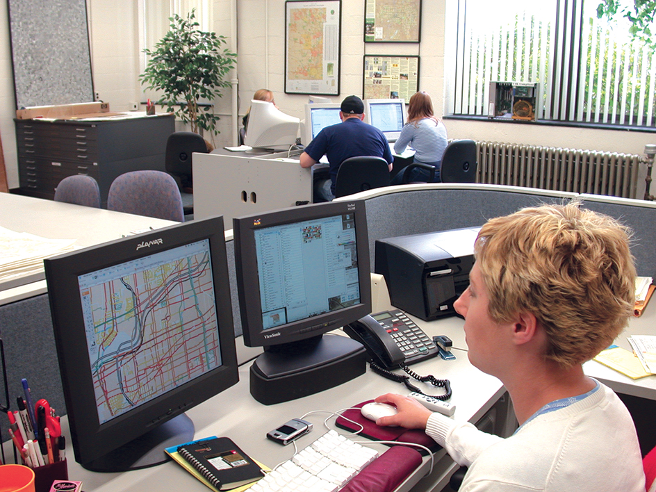
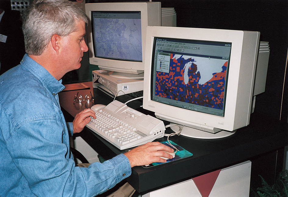
Mapmakers may draw maps with hand or mechanical methods. In most cases, however, they produce maps using powerful computer tools. These tools include geographic information systems, mapping programs, and computer-aided design programs.
A geographic information system (GIS) includes a computer to process information, a monitor that displays maps as they are created, and printing equipment. The most important part of a GIS is the software (sets of computer instructions). GIS software enables cartographers to work with databases to extract the information needed for a particular map. Cartographers can experiment to develop the best map by adding or removing information, overlaying one map on another, or rotating the map.
A mapping program provides a more limited means of working with databases than does a GIS. Mapping programs have limited capabilities for adding or removing information, and users generally cannot overlay one map on top of another. Cartographers use mapping programs chiefly to create thematic maps.
A computer-aided design (CAD) program enables users to draw maps one symbol at a time. Cartographers use CAD programs to create maps that are not produced from databases. CAD programs are also useful for putting finishing touches on maps created using a GIS or mapping program.
When a map is finished, the cartographer can print a small number of copies on an ordinary computer printer or on special printers that give superior color reproduction. If a large number of copies are needed, the cartographer may use a CAD program to produce a digital file for use on a high-quality offset printing press.
Different steps are needed to produce maps that have a raised surface, such as raised relief maps. These maps are molded from plastics or other materials to produce elevations that represent hills and mountains. Another type of raised map is a tactual map, which has raised symbols that blind people can read by touch. Some tactual maps are created by photocopying a printed map onto a special material. When this material is exposed to bright light, cells in dark areas of the design swell and burst to produce raised images.
Revision.
Our world changes constantly as a result of geographic and political events. For example, changes may occur in the boundaries of nations or the population of cities. The shape of coastlines or the area of forests may vary. Databases must be updated, and maps must be revised, to reflect these changes. Aerial photographs and satellite imagery often provide new data for revisions.
History
Ancient maps.
One of the oldest existing maps appears on a clay tablet made in what is now northern Iraq about 2300 B.C. This ancient map shows settlements, waterways, and mountains. Later, the ancient Babylonians, whose empire was centered in what is now southern Iraq, had a lasting influence on mapmaking. They developed the system of dividing a circle into 360 degrees. We use this system to measure latitude and longitude.
The Egyptians made maps before 1000 B.C. They developed geometric techniques of surveying, probably to remap property boundaries each year after the Nile flooded its banks.
The Greeks made great advances in geometry and surveying, and they developed systems of map projections. They also thought deeply about the size and shape of Earth. The Greek mathematician Eratosthenes calculated the circumference of Earth with remarkable accuracy in the 200’s B.C.
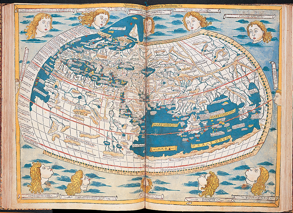
One of the most influential cartographers of ancient times was Ptolemy, a Greek astronomer and geographer who worked in Alexandria, Egypt, about A.D. 150. Ptolemy created Geography, an eight-volume guide to mapmaking that combined his own ideas, the work of other scholars, and travelers’ reports. This work included instructions for making map projections and a list of about 8,000 places along with their latitude and longitude. Zhang Heng (Chang Heng), a Chinese astronomer who worked at about the same time as Ptolemy, developed one of the first geographic grid systems for maps.
Maps in the Middle Ages.
During the Middle Ages, the period from about the 400’s through the 1400’s, progress in mapmaking occurred mainly in the Arab world and China. Ptolemy’s Geography was translated into Arabic in the 800’s. Ptolemy’s ideas inspired Arab cartographers to determine the latitude and longitude of the many places visited by Arab soldiers and traders. Cartographers also collected geographic descriptions from the travelers. In the mid-1100’s, the Arab cartographer al-Idrisi made a rectangular world map consisting of 70 sheets that contained much new information.
Also in the mid-1100’s, an unknown Chinese cartographer made a carved stone map of China’s land, coastline, rivers, and settlements. The accuracy of this map was not equaled until modern surveying techniques were developed. The earliest known printed map appeared in a Chinese encyclopedia about 1155, more than 300 years before printed maps were produced in Europe.
Little scientific progress occurred in European mapmaking during most of the Middle Ages. During the late 1200’s and the 1300’s, however, European mapmakers began producing portolan charts, a type of navigation map for sailors. Many of these charts showed coastlines of the Mediterranean and Black seas in remarkably accurate detail. Lines across each chart helped sailors determine compass directions.
Advances in European cartography.
Three important developments in the 1400’s contributed to progress in European cartography. First, Ptolemy’s works were rediscovered and translated into Latin, the scientific language of the time. This rediscovery led to renewed interest in Ptolemy’s methods of map projection and of locating places systematically. Second, the invention of the printing press in Europe in the mid-1400’s made maps more widely available. Many identical copies could be produced by printing maps rather than by copying them by hand. Third, an age of worldwide exploration began in the late 1400’s. The great voyages of discovery increased knowledge of the world and stimulated interest in mapmaking.
By the late 1400’s, educated Europeans had accepted the idea that the world is round. In 1492, the year that the Italian navigator Christopher Columbus reached the Americas, a German merchant and navigator named Martin Behaim produced a globe. This globe represented the world as Europeans knew it before Columbus’s voyage. Behaim’s globe did not include the Americas, and it showed the Atlantic Ocean as much smaller than that ocean actually is. Mapmakers began including the Americas on maps by the early 1500’s. The name America first appeared on a map produced in 1507 by a German cartographer, Martin Waldseemuller.
In 1569, the Flemish geographer Gerardus Mercator created the first map based on his Mercator projection. This projection was of great value to sailors because a path in any direction appears as a straight line. The first collection of maps designed specifically to be combined into an atlas was produced by the Flemish mapmaker Abraham Ortelius in 1570. 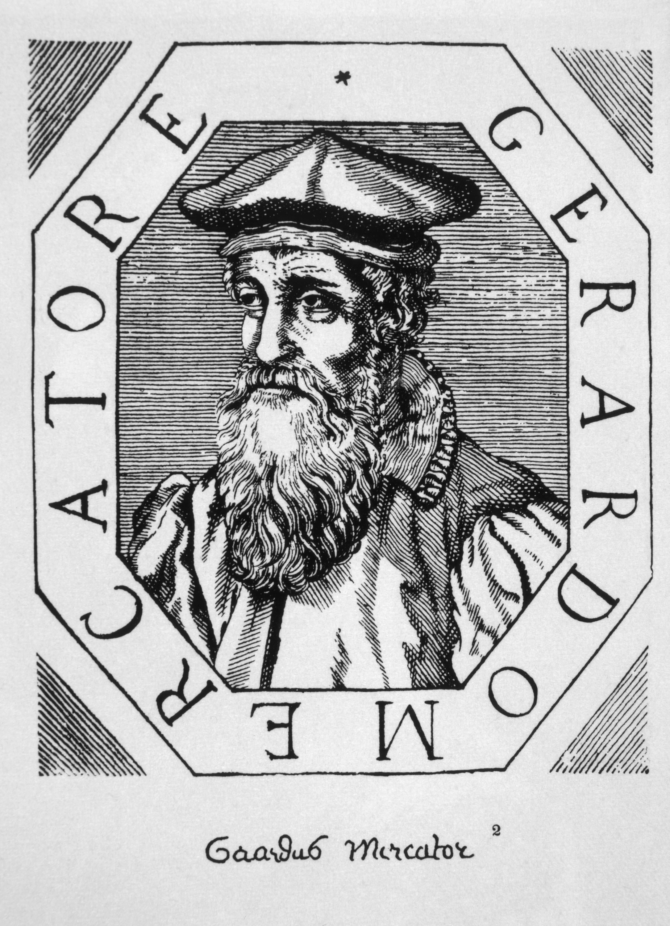
Scientific activity during the 1500’s, 1600’s, and 1700’s resulted in new instruments and techniques that made measurements of location and elevation more accurate. In the late 1600’s, Giovanni Domenico Cassini, an astronomer at the Paris Observatory, began a project to produce an accurate topographic map of all of France. The last few of the map’s 182 sheets were completed more than 100 years later under the direction of Cassini’s great-grandson, Jean-Dominique Cassini.
In 1686, the English astronomer Edmond Halley developed what is considered the first weather map. This map showed the trade winds, part of Earth’s vast system of winds that were of great importance to early sailors. Around 1700, Halley also created a map of Earth’s magnetic field, the region around the planet in which its magnetic force can be detected. This accomplishment was the first published map that used isolines to connect points of equal value. In the mid-1700’s, the English clockmaker John Harrison built the first timepiece able to keep accurate time under the severe conditions at sea. This timepiece enabled sailors to measure their longitude with much greater precision than before.
Mapping the Americas.
From the 1500’s to 1700’s, the colonization of the Americas by Europeans created a need for many new maps. The Spaniards surveyed and mapped the lands under their control. In 1612, the English adventurer Captain John Smith drew an influential map of Chesapeake Bay. Smith also made the first English map of New England. During the early 1600’s, the French explorer Samuel de Champlain mapped the region from what is now Maryland to the St. Lawrence River.
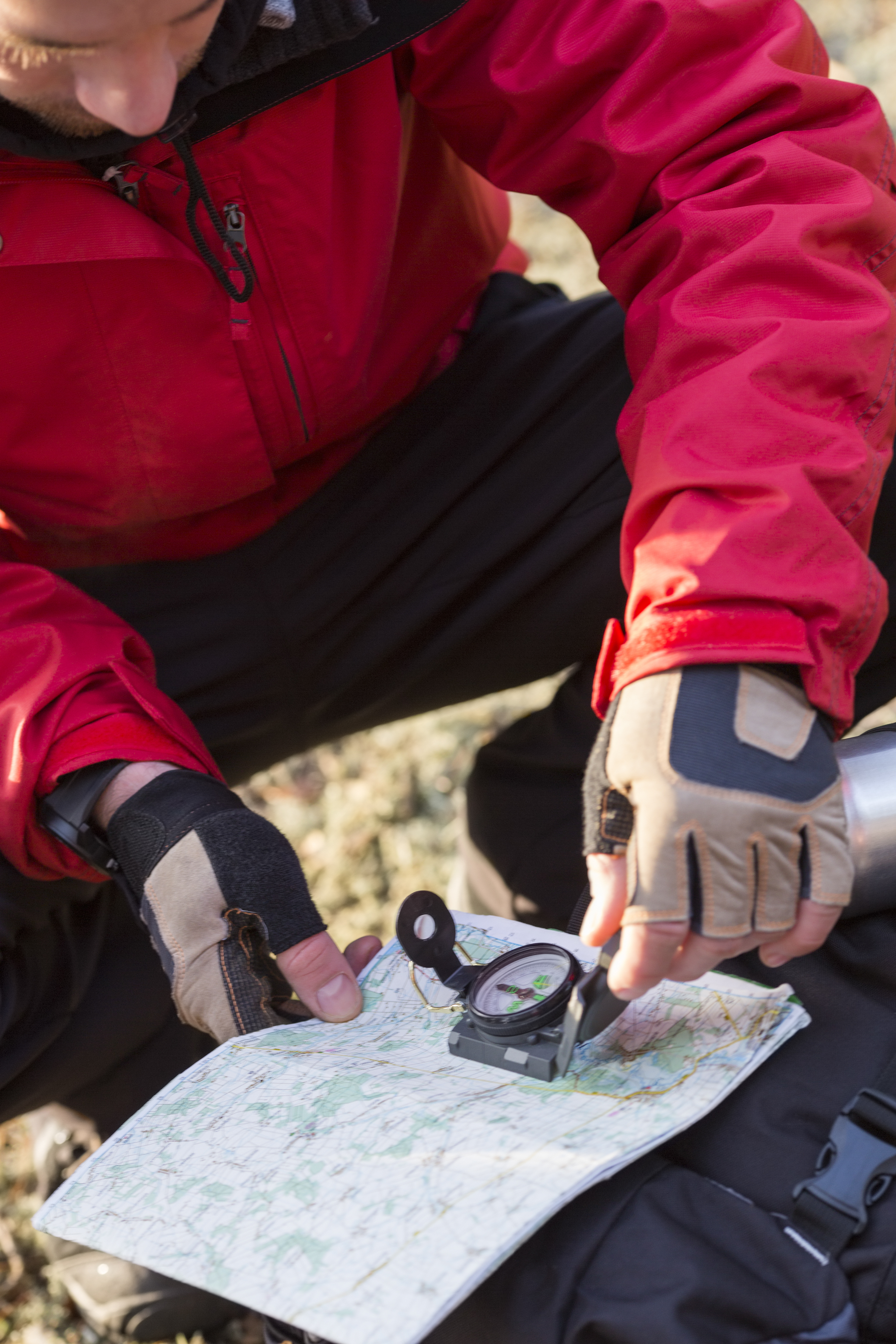
Surveying—that is, determining the location and boundaries of places by measuring angles, distances, and heights—was an important activity in the American Colonies. The surveyors Joshua Fry and Peter Jefferson produced a map of the region from Virginia to the Great Lakes in 1751. In 1755, John Mitchell, a Virginia colonist, compiled his Map of the British and French Dominions in America. A copy of this map was used to mark the boundaries of the United States after the American Revolution (1775-1783).
As pioneers moved westward during the 1800’s, explorers and army engineers mapped trails and surveyed government lands. The U.S. government established two agencies with responsibility for detailed, large-scale mapping. The Survey of the Coast was founded in 1807. Its successor agencies are today part of the National Oceanic and Atmospheric Administration. The U.S. Geological Survey was established in 1879 and still exists today.
Development of thematic and inventory mapping.
By the 1800’s, it had become common for governments to collect population data by taking censuses. Cartographers then created thematic maps to display and study this wealth of new information. The British cartographer Henry D. Harness advanced thematic mapping with several maps of Ireland published in 1837. These maps used tones to indicate population density, black circles of different sizes to show the population of cities, and lines of different thickness to represent traffic flow.
In 1855, John Snow, an English physician, dramatically demonstrated the value of inventory mapping for scientific research. On a map of London neighborhoods, Snow used a dot to represent each person who had died of cholera during an epidemic. A large number of dots clustered around a water pump on Broad Street. This pattern helped identify water dispensed from that pump as the source of the epidemic infection raging through the city.
Mapmaking and modern technology.
During the first half of the 1900’s, improvements in printing and photography made it cheaper and easier to produce maps. As a result, maps became more readily available and widely used. Development of airplanes and automobiles in the early 1900’s created a need for aeronautical charts and road maps.
Airplanes also made possible aerial photography, the first remote sensing technology. Remote sensing involves gathering data with a device that is far from the object being studied. Aerial photography remains widely used. Remote sensing is now also performed with electronic sensors, such as radar and infrared imaging systems, that reveal features invisible to the human eye.
Many remote sensing devices are carried in spacecraft. Spacecraft have provided an increasingly important source of geographic information since the mid-1900’s. Space exploration has given mapmaking a variety of new technologies, such as the Global Positioning System of satellites. Space exploration has also expanded mapping of moons, other planets, and the vast reaches of space.
In the late 1900’s, computer equipment replaced hand and mechanical instruments as the most powerful and important cartographic tools. Cartographers began to use geographic information systems and mapping programs to create maps.
Since the late 1900’s, interactive mapping sites on the Internet have made vast amounts of geographic data available to individuals and businesses. These sites, such as Google Maps and MapQuest, allow users to select map or satellite views and create detailed travel itineraries. Today, users may also construct custom maps by combining map data with other information into hybrid maps called mashups. For example, a business might combine information about its customers with cartographic data to create a mashup map. Details about each customer would pop up in a bubble when a user scrolled over the customer’s location on the map. Photographs, videos, and links to other websites can also be embedded within the maps at specific locations, enabling users to find additional resources.
Maps customized on the Internet can be saved for personal use or shared with other users. Educators use interactive mapping sites to teach geography skills to students and to create maps for lesson plans. The Internet has also become an important source for navigation maps accessed by handheld computers, such as personal digital assistants and smartphones.