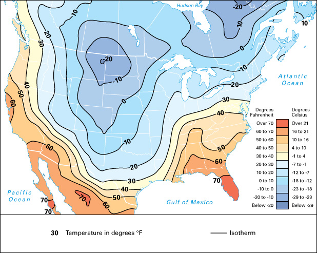
Isotherm, << EYE suh thurm, >> is a line drawn on maps to connect places that have the same temperature. In the past, a weather observer drew isotherms by writing temperature measurements on a map at the locations where the measurements were made. Next, lines were drawn that connected locations with the same temperature. Today, this process is automated. It makes use of temperature data collected hourly worldwide.

Isotherms normally are plotted at constant intervals, such as intervals of 5 or 10 Fahrenheit or Celsius degrees. Maps depicting isotherms can cover an area as small as a city or as large as the entire Earth. Isotherms can be used to depict the temperature at an instant in time or the average temperatures over a longer period, such as a day, month, or year. Meteorologists (scientists who study weather) often color the spaces between isotherms to enhance the clarity of a map. Warm temperatures are often depicted as shades of red and orange. Cold colors are often shades of blue and violet. Because temperature can vary considerably across a region, isotherms typically follow curved or wavy paths.
